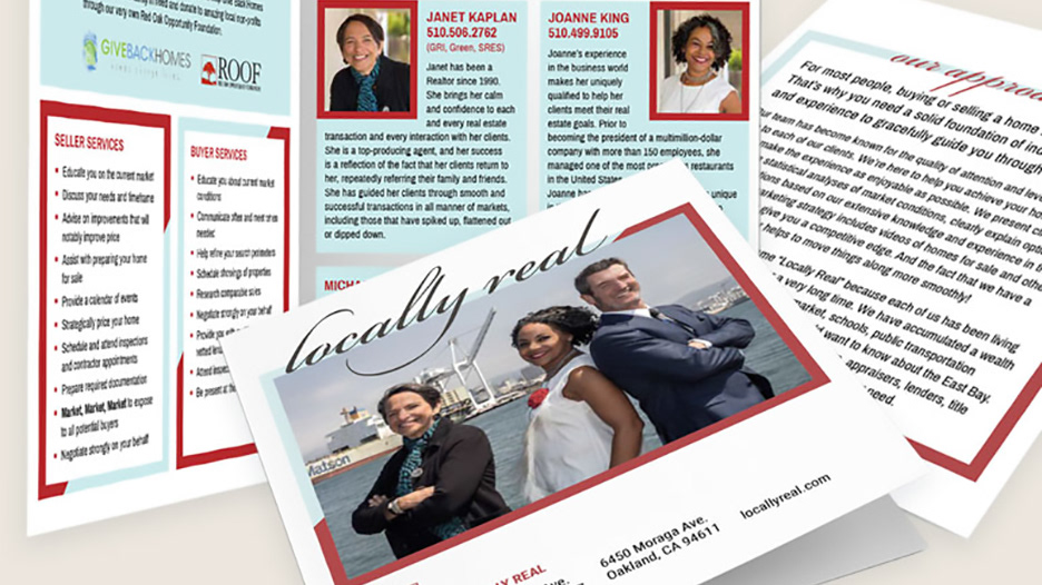
Locally Real is a locally-focused residential real estate team of three realtors. They are affiliated with a larger real estate firm (Red Oak Realty) that went through a rebranding effort, and Locally Real needed an updated brand that worked well with their parent company's new brand.
The Locally Real team is friendly, knowledgeable, and down to earth. The three realtors have different strengths and personalities that come together to balance each other out and provide holistic benefits for their clients.
To represent this trio, I worked with triangle shapes in my concepts. The final design incorporates a triangle, but also represents a house or a real estate sign outside of a house. The stacked design and red bar complement their parent company's logo. The lowercase "real" and iconic graphic give the team a more fun look and differentiate Locally Real as an individual brand.


